科学の箱

科学・IT・登山の話題

Python

SIGNATE お弁当の需要予測-3

投稿日:2018年5月15日 更新日:

Seabornを利用してデータをビジュアル化してみる。
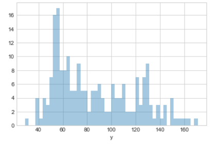
まずは売り上げの分布図から


sns.distplot(d_train['y'], kde=False, rug=False, bins=50)
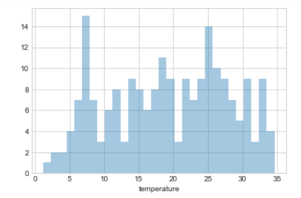
次に気温の分布を確認する


sns.distplot(d_train['temperature'], kde=False, rug=False, bins=30)
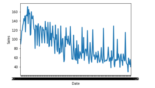
 

売上の時系列トレンドを確認


fig=sns.pointplot(x="datetime", y="y", data=d_train, markers=[""])
fig.set_xlabel("Date")
fig.set_ylabel("Sales")
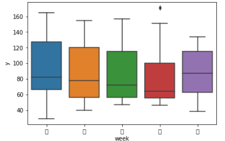
曜日別に売上分布を確認する。


fig=sns.boxplot(x="week", y="y", data=d_train)


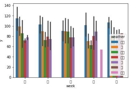
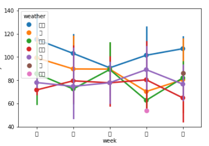
曜日別の売上を天気別にみて統計的に変化があるかを確認する


fig=sns.barplot(x="week", y="y", hue="weather", data=d_train)

fig=sns.pointplot(x="week", y="y", hue="weather", data=d_train)


メタ情報

inarticle


メタ情報

inarticle


-Python
-

執筆者:


comment

メールアドレスが公開されることはありません。 * が付いている欄は必須項目です

関連記事

no image

automated the boring – day9

https://automatetheboringstuff.com/chapter17/ >>> from PIL import Image &gt …

no image

automated the boring

まずは肩慣らし print(‘Hello world!’) print(‘What is your name?’) # ask for their na …

no image

numpyで配列を抜き出す方法

numpyで配列を抜き出す まず基本となるやり方 arr = np.arange(50).reshape(5,10) arr[1:1,] arr[1:2,]   np.arange(50)で …

no image

errorbarで誤差棒付きグラフの作成

概要 学習モデルのグラフは誤差を含んでいる。今2軸(xおよびy)をとり、以下のようなモデルに近似したとする。実際のデータは誤差がある。この誤差を表示できるのがerrorbarである。 ドキュメント h …

no image

配列をリストから生成

配列をリストから生成 numpyにおける配列はnp.arrayを使って生成する。最も基本となる方法はnp.arrayに引数としてリストを渡してやる方法である。 まずは整数の配列を生成してみる。 pri …

2018年5月
« 4月   6月 »
 123456
78910111213
14151617181920
21222324252627
28293031  

side bar top


アーカイブ

カテゴリー